As has become tradition in the Myers home, when life gives us lemons, we start a new project! (Oh, and we made lemonade sometimes too!)
Last spring, during the eleven weeks between Evie’s diagnosis and death, Ryan and I set to work finishing our master bedroom. Also, Katy and I took a day trip to the Atlanta Ikea to overhaul our living room. Oh, and I painted the dining room 3 separate times.
Last fall, when we lost baby #5, I got to work refinishing an ugly (yet solid) dresser one of our neighbors had deposited on the curb for the trash man:
Oh, and we also completed our living room with a new sofa and worked on the stairway project.
You get the idea: when we’re sad, we busy ourselves. I think it’s pretty clear here that decorating is one of my coping mechanisms. Fortunately, my husband is understanding and we have a “rainy day fund” for times such as these. (I wonder if we should begin to set aside money in a “sunny day fund” and see if we start getting some sunny days? Hmm…)
This time, I want to do something a little different. I figure since I already involve you all in nearly every other aspect of my life, why not this one too?
How would y’all like to play Interior Designer with me?
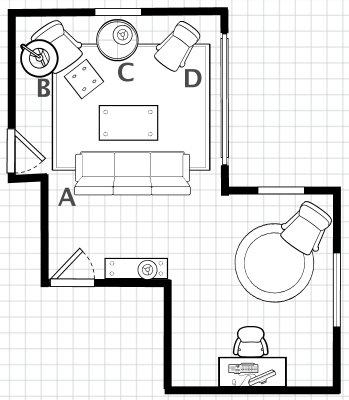
This is how it will work: I’ll give you an idea of the space (see floorplan below) and some info about our goals, the pieces we’ve already chosen, etc. And, what I’d love, is to hear your input about colors and accessories – the things that will really give the room it’s character. This could be fun, no?
The lucky room this time is our bonus room (turns out “bonus room” is a term only used in the South or in newer construction or something – it is basically an upstairs family room, office, playroom, workout room, whatever you like. It’s just an extra room. Hence the name: “Bonus Room”.)
Here’s what you need to know:
- It functions as Oliver’s play room and as our family room. It’s more relaxed than the living room and we also have a *gasp* tv in this room. See the long, window-looking space on the right wall near the “D”? – those are built-ins and that’s where the television is. (The floorplan is on a 1/4″ = 1′ scale, if anybody cares about that sort of thing.)

- The door in the bottom left corner is the entrance to the room. The other door on the left is a short door which leads into Oliver’s “clubhouse” which is a finished storage space in the eaves of the roof.
- The bottom right section of the room is the space Ryan uses as his office. We’re thinking we’ll call that phase two. (It’s not a huge rainy-day fund!)
- The top of the floorplan faces East. It gets LOTS of light all day long through that window, which reaches from the floor to ceiling.
- This is what the room looks like when it’s empty. This would be your view as you walk into the room. Can you see a bit of the built-ins on the right?
- We have already purchased some of the main furniture pieces. It’s important for you to see these so you can get an idea of the style and color we’re working with.
- As you can see, the furniture that we’ve chosen is very neutral. This leaves the color palate wide open! (We know we’ll likely want to change things up in a year or two, so we leave the commitment of color and pattern to the less expensive, more easily replaced things.)
- I would LOVE your input now when it comes to colors. I’ll show you a few color schemes that we’re considering and you can either comment on those or suggest different color schemes altogether. You’ll see in the images that we’ve included different accessories such as pillows, rugs, lamps, window treatments and wall art. None of this is set in stone. If you have good suggestion, please, pipe up! (pipe in? which is right?)
WHITE
- I think the only other thing to note is that we cannot paint the ceiling. As much as I’d love to let that play into the design, it’s textured and we’re not messing with it. (And, yes, I took the lampshade off the image of the dark orange room – the teal just wasn’t working with the orange.)
That’s all! Please, help us with our project! I’d love to hear suggestions and such!
In the words (and unmatchable voice) of Tim Gunn from Project Runway, “Designers, carry on!”


>I like blue, dark orange, poppy, charcoal and white and in that order. I love using the high hung window treatment to bring height to the room. Can’t wait to see it!
>I like the blue the best, with poppy second. Not such a fan of the white, to be honest. Have you ever thought of apple green with the black/white/charcoal palette? I like the Ikea rocking chair, btw. I want that for Charlotte’s room.
>Yeah, the Ikea rocking chair is a great deal! Plus, making new slipcovers for the square cushions would be a cinch if I have got a hair to do that!
>Are we really get votes for POPPY???
THAT is not poppy. That is fuschia! Although I kinda like it….but, no. If there was more orange it that color, I could go for it.
I do like the charcoal with the striped rug.
My order (high to low):
Dark Orange
Blue
Charcoal
White
Poppy (unless revised)
>I like Christine’s idea of the green, although I would go with Kelly green, with accents like that red floral pillow, and maybe some yellows…
mmm, color….
>Green is ALWAYS my vote. I always gravitate toward it. And I agree, the poppy is a misnomer, but I like the pink tint.
Yay for color!
>oooOOOOOOo, I like the blue the best. <3
btw- we do the same thing. normally, we search for new things. like a jogger, or new bed frame. Sometimes we paint a room or dresser. It puts my grief into some kind of positive energy…which is a good thing. :)
>When I saw the furniture, I instantly thought green. I love the charcoal one with that rug too. What a fun project, can’t wait to see more!
>Green Green Green. Well, it is my all time favorite color, but like most people have already said-It would be so beautiful against all that charcoal. Also, I really need to know where the couch is from! I’m embarrassed to admit that for the last 2 months, I’ve been dreaming of a nice modern dark gray couch for when we return from Africa, and I sometimes spend too much time shopping for one on the internet. Maybe I should start a ‘Not Me Monday’ post!
>Bethany-
We found the sofa at West Elm (www.westelm.com). It’s actually a really cool velvet material – nice and modern and soft too!
Also, I hope you do start writing “Not Me Monday” posts – it would be fun to read!
>well…I always love green! However the blue is my favorite!! Have fun!
>That’s the exact pattern and color Ikea Chair that we have… when did yall get that??
I vote the red color..
>nevermind..looked again, i think green.
>Katy- I know! That’s where we first saw it and liked it! We haven’t gone to get it yet, so if you’re up for a day trip let me know!
>West Elm, eh? well, maybe we can find something like it on craigs list :) i have also been planning (in my mind-late at night) to get that same rocking chair from Ikea. Do you know about Modern Nash? http://www.modernash.com/furniture/instock.php
i can’t decide if it’s legit or a shady deal….there is another similar company in St. Louis, too.
>Modern Nash is legit, But they do charge around 25% of the total price.
My good friend uses them all the time in her interior design company.. and has been happy.
>Modern Nash is still cheaper than Ikea delivery even if you have them to deliver to your home. You can save more by picking up from their central location in Nashville.
Have you considered the 2009 Pantone color of the year? http://www.casasugar.com/2618229 A little bold, but very cheery :)
26 February
>Definitely blue! And I have used Modern Nash before. They are legit and very professional. Way cheaper than Ikea shipping or driving to Atlanta.