>
So, I am slowly but surely working my way to a pretty little blog redesign. (And by “I”, I mean “Ryan”. C’mon, you don’t really think I’d tackle this kind of thing myself when I have design gold laying his head on the pillow next to mine at night, do you?)
Anyway, we’re kind of held up right now because he’s asked me to settle on a color scheme. You guys, I’m so bad at commitment when it comes to color. Seriously. You know about how often I paint my walls, don’t you?
Anyway, I’m trying so hard to focus and commit but color is just so doggone pretty. Just not when you try to cram ALL of the colors in one palette and expect it to come off as dignified. Not then.
I know that muted pinks and teals are very en vogue for blog design right now. And lots of pretty scrap booking details too. I’ve put together many of these and they are all lovely, but the truth is, they’re just not me. And I really want my blog to be me.
Fair enough.
So, I really focused tonight. I love clean design. Lots of white space. (This is why I can only appreciate scrapbooking and can’t actually enjoy doing it myself.) I also love bold colors. (This is why I’m not fitting well into the muted colors trend.)
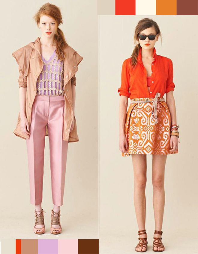
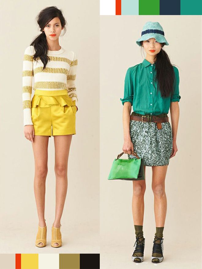
I draw a lot of my clothing inspiration from stores like J.Crew, so I hopped over there to see if perhaps I could also draw color inspiration from that same style. In browsing through J.Crew’s Spring Lookbook I found lots of color schemes I liked very much. So, I dragged them into Photoshop and got to work with my little eye dropper tool.
Here is my progress thus far:
(FTR: I’m 100% positive I would never be able to pull off either of these first two outfits with even an ounce of dignity -or maybe if I buttoned up that cute red shirt it would work out just fine – I mostly just like the colors.)
(And I like the navy/orange/cream combo here.)


>I really like the colors from the 4th picture- the teals, navy, green, etc.
>I like the teal! Can't wait to see what it looks like.
>I like clean looks too, with lots of white space! Every time I scrolled down I thought, "ooh, I like that one!" and then, "ooh, I like that one too!" I'm sorry, I'm no help! Although honestly the thing that stuck out to me the most was the messy hair on the models! They need some serious combs!!
>A new design – how fun! I like the navy/orange/cream as well as the light teal/green. Can't wait to see the finished product.
>I love the teal with any combo you've shown. Especially the orange.
I am in the middle of trying to redesign my blog too – but for me that just means going and finding a free template somewhere. Nothing fancy or customized. I'm excited to see what Ryan puts together.
I'm coming to Nashville in September and will be visiting Franklin also. I'm excited to see your cute little hometown. :)
>I like the one second from the bottom with the teal, yellow, and red. It matches your family pictures perfectly, which I think says something about how much you like those colors. But really, I like all the color combos and think you could make any of them look fun and fresh like you. . . Can't wait to see the end result.
>I love the orange/cream/navy and the teal too! I'm a little indecisive myself. :) My blog is mostly white and I change out the header photos often but I am certainly missing some color.
I have read your blog for a bit now and just love it. Wanna know what got me hooked? The garage sale posts of all things! I loved seeing what you found!! You got me started. But I never really find that great of stuff. I think i'm not going to the right places.
And while reading your garage sale posts I saw that you and I were only a couple weeks apart in our pregnancy's with our daughters. So that was fun to read along to too. :)
Also wanted to say that i'm a runner too and so wish that I could join y'all in Memphis but it's a little too far from Orlando. Boo… Maybe next time do the one in Nashville? I have friends in Franklin and I could stay with them. Just an idea! :))
Sorry for the long comment. I never do and all of a sudden thought maybe I should today. hahaha
>Hi, I've been reading your blog for some time, but this is my first comment. I love seeing your garage sale finds :) and your beautiful family,love your house too :) guess I like everything haha. I personally LOVE the forth picture with the teal and green etc. Good luck I'm sure it will turn out GREAT!
>This is tough indeed! My vote is: Bottom Left Corner Yellow Lady. OR, the swatch that you called "i like the teal in this one." GOOD LUCK and HAVE FUN!
>I love them ALL, I see why it's so hard! But my favorite are the last two, or the very top minus the red :)
>i haven't read the other comments but the teal really caught my eye and reminded me of you…does that make sense? I like the second combination with teal in it.
>I can see why you're having a hard time… I LOVE them all. Love the teal one (2nd from bottom) but I also love the bottom one with orange and navy. I am no help! :)
>I think the teal is a definite because it popped up in several of your color palates. Combining it with the silver and navy blue (from the top) and using mustard yellow as an accent color would be beautiful!
On a side note I absolutely love reading your blog. Thank you for your creativity and wonderful posts!
>I can't even decide TO redo my blog, so I don't envy you. I'm a big teal person so that's my vote. I'd say stay away from darker colors whatever you do. It's really hard to see.
>Here's my two cents: THOSE MODELS' LEGS GO ON FOREVER, HOO-BOY.
Also, I lurve teal. But that's just Christine. I'm just Ryan and Raechel, with their powers combined, will come up with awesomeness.
May I suggest a super hero-themed, heavily photoshopped blog? Preferably involving underoos?
vally!
>I love your blog, But very rarely comment. Your family is wonderful. Can't wait to see what Ryan comes up with. My personal favourite is the green lady inspiration. I love blues, greens, grays and black and white.
>I absolutley love jcrew as well!! my favorite color scheme would have to be the fourth one on the right (the blue and green one). I know I dont comment that much, but I love your blog!
>I am sure whatever you choose will be wonderful. You have impeccable tastes which is why I keep coming back to your blog! :)
>I'm sure it will be lovely and very you! I read once that your blog should reflect your home. Mine does. The same colors I use on my blog are in my home. Yes, my hubby loves the pink! ha. He tolerates it! I can't wait to see the reveal!
>I'm loving the teal outfit and the last color strip with navy, cream, white, etc. :) Good luck! I am sure it will look amazing!